The brand owners of Georgia’s Choice were looking to modernise the design of their packaging and briefed Alexir Creative.
Alexir Creative were approached by the brand owners of Georgia’s Choice to modernise their current packaging. This included a redesign of the logo and artwork on their packs in the frozen category to keep it fresh and in line with design trends.
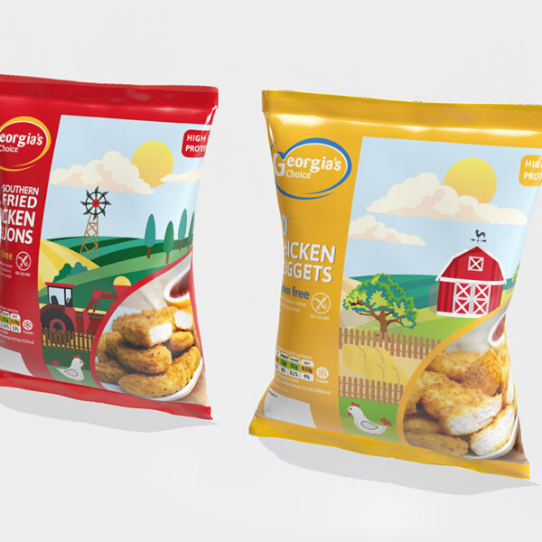
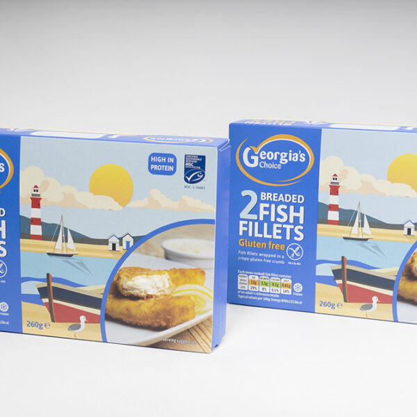
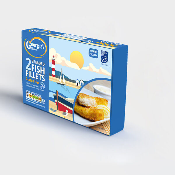
It was important that the new look differentiated Georgia’s Choice from other mainstream competitors and created shelf space in a busy retail aisle. To achieve this, our graphic design team analysed visual cues used by competitor brands and investigated current design trends. From this information, our graphic designers choose to use punchy backgrounds of red, yellow and blue seldomly used by other brands.
To further drive differentiation our graphic designers created a range of bespoke illustration vistas of the sea, countryside and a farm to be used as artwork on the packs. The logo was modernised but kept its original essence. To dial up the new design, Alexir Creative shot new photographs of the goujons, nuggets and fish to be included on the packs.
The new, modern branding approach created strong on-shelf standout and provided new brand clarity.
Raquel Baumela-Bueno, Graphic Designer lead, said, “Red House have a great NPD team and it was a pleasure to be able to work with them on the Georgia’s Choice brand. The new re-brand sits well in the frozen section and looks clean and modern”.
